Monday, 14 December 2015

Back page of Digipak

Imagine Dragons back page
Our group took inspiration from the back cover from imagine dragons. As we felt that imagine dragons back page conveyed similar conventions as our band.

The colour of the digipak is primarily black with simplistic white text. The small text to prove copyright was also very hidden and discrete which our group felt that we should continue.

Our groups back page


Despite our group taking inspiration from the imagine dragons back page our cover page still looks completely different.

The background is the same as the front page as my group felt that we should continue the texture throughout the digipak. The text we used was to carry out the continuity with the front page. In order to enhance the text behind the text I had to use the paint tool to add a black colour on the text allowing it to stand out.

Sunday, 13 December 2015

Adding to the Digipak

Background

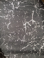
I want the background to be very stylish look for the space therefore as I was in school I noticed one guy that was wearing a very stylish jumper. The colours suited the colour of outta space but looked very interesting. However to bring out the black colour I had to add the pin light effect onto the texture without getting rid of the white in the picture.


The Planet

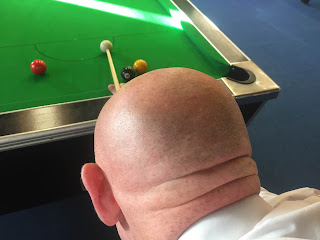
As i didn't want to copy a picture form google onto our band cover I felt that I had to find a picture of a rock or something with a similar shape. However my friend recommended taking picture of a  teachers bald head this immediately was brushed off. However once I saw my bald math teacher Mike playing pool it immediacy reminded me of the planned therefore I sneakily took a picture of his head!


Band Members on the planet


 The concept was tho have one of the band members standing on the planet alone a bit like the Imagine Dragons songs. As I was truly inspired by the image on the imagine dragon logo. However this didn't work out for our band album as the background is too dark and doesn't stand out enough.


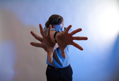
 However as I was walking back after I took pictures of the drummer I saw and interesting shadow that gave me an idea on what to add onto the planet. I though it would be simple yet artistic. This seemed perfect however all of the shadows was all the same therefore I had to add the paint tool to fill in the hands to make them all seem different.


Title


For the title Perry found a bunch of different fonts to see, which one would suit more with the band. Then I used a paint brush tool to make a paint look towards the album with some wavy text. However Perry wasn't fond of this idea therefore as we were looking though different font he preferred called long distance call regular. 


Beginning of the making of the Album cover


As I spoke with everyone in the group we felt we should have this album should have a out of the world feeling. Therefore Freddie had this concept of having the man on the moon. Having a astronaut holding a flag of the band (lion). 


Therefore I tried out this concept however I felt that it didn't have that same feel/appearance as Feddie pitched it. I think its because the moon looks epic however the cartoon of the man of the moon doesn't stand out. This defeats the purpose of the “man of the moon” and I felt it would have been cooler having a picture of one of the band members in a astronaut suit like an actual picture on the moon. However this was too optimistic for our bands first band album.

However I didn't want to steer away from the idea of outer space. Therefore I spoke with a few of the art students within my school and explained them the concept then they illustrated me the concept. When I spoke to teacher about this concept the told me that he though that the drawing seemed to have a very metal approach.

 However this gave me the idea to carry on the idea of how the planets are arranged. Therefore i had found the base of the digipak! However I felt to make the digi pack more artistic I had to add/change the planet.

Digi Pack - Beginning


As our group began to think about how the digi-pack would look like we looked at serval different album covers from alternative rock bands. This would give our group a base to how our digipak should look like. The one standout thing that all these albums had in common was that they all had some sort of animation and didn't have any pictures of the band member. Therefore I felt that our band cover should not consist of any pictures of the band members in the front page.

Thursday, 10 December 2015

After Effects

One of the huge debates I had with the media department was whether or not to have a security guard within my music video too show at the end of the music video the band isn't real and just imaginary. This was a way for my group to add some kind of narrative towards the music video as I felt having a all performance music video may be seen boring towards some people.
However as I was editing this I made a simple mistake during the recording stages as I forgot to record the band playing without the security guard in the scene or vise visa where there should be a pan without the ban in the scene this meant that I couldn't have the smooth transition I wanted to have. Therefore as a whole I chose not the have the narrative within my music video

Sunday, 6 December 2015

Feedback for Website


From the feed-back we were given the main objective we had to change was the background photo. This was because we were still learning how to use Wix making it look unfinished and unprofessional. Many people think the gallery seemed very scruffy as the positioned well. Another thing was that people felt that the website didn't suit the genre of the band as it seemed very indie and didn't have a lot of rock elements inside.


Saturday, 5 December 2015

Website

Our group chose to use Wix as a website maker. This was due to the fact that they found WordPress more complex and not very user-friendly. My group then watched tutorials on the basics how to use Wix therefore, it gave us a basis on where to start. Due to Wix's large number of available templates with different theme's given it seemed like a more viable option.


My group went for the Jazz Musician template as it had a very urban feel towards it plus it also reminded us of the Imagine Dragons website, due to its simplicity. Our group had also planned a photo shoot of the band in order to add more pictures on our gallery.

Update


These are the few photo's we were able to grab in the studio alongside with photo's on our shoot day. Now the way we are going to carry forward with this is by eliminating some photos which don't seem to fit with each other.

Friday, 4 December 2015

Feedback from Editing

As i have finished my cut of the music video I went out to seek advise on the editing of the music video. Therefore as I presented the music video I received various different feedbacks, which I would choose to follow or ignore:

  • Extend the time lapse of the the city outside
I was told this by various different people as they believe that the shot duration should be longer as its a very beautiful shot. Initially as the the weather in UK is very inconsistent therefore I thought it would be nicer if it was shorter. Nevertheless I thought it would be nicer to have a longer shot of the time lapse as it made our music video more dynamic. 

  • Continuity of some of the shots
Personally I felt continuity is key within my music video. However as I was editing there are some shots that need to be placed in order to make it seem more upbeat and fast. This obviously meant that there was going to be a few continuity flaws nevertheless the fact that I am editing means I am naturally going to stress about all the small details however once I showed it to a large no. of people they didn't notice any difference. Therefore I only made a few tiny patch ups of some of the continuity mistakes.

  • Reduce the time spent on the roof before it pans down (night time shot)
As the roof is not seen through out the music video my group felt maybe it would be nicer if it had a shot duration time on the roof. This was because as the time lapse was shorter this meant there was more time spent on the camera facing the roof therefore as I extended the time lapse then the time spent on facing the roof was shorter. Meaning that the problem was already fixed!


  • Lighting!
One thing I haven't done in my music video was colour grading therefore it meant that the change in the day time was very disjointed meaning I would have to colour grade each shot to make them similar.


As a whole I received positive feedback from my style of editing through the use of short and simple cuts. As I felt for our music video we needed to cut to most of the drum beats so make our music video more interesting as we didn't have a narrative to cut into. As we had a wide range of different shot it allowed me to more flexible with the editing and not show the same shot after two cuts.